Chapter 9 - The Importance of the Right Visual
When you browse through the book shelves or the pages of
your favourite website what is it that first attracts you to a book?
What is the first thing that catches your eye and draws you
in encouraging you to delve deeper and find out if that is the book for you?
The Cover is one of the most important elements of
attracting readers to your book, it’s the first impression your work will make
so it has to be a good one.
There’s an art to cover design, a fine balance of the right
image, the right text, the right font and the right colours. It has to convey the story implicitly, in a
way that not only catches your eye but promotes the story in its intended
form.
I’ve always said I’m not an artist, I’m a creative, I can
put pen to paper and weave images but hand me a pencil and ask me to draw and
the most you will get is a stick figure.
So for cover design I rely on an artist.
Over the last few years I’ve worked exclusively with Jeanie
Henning, she not only an amazing artist but a great communicator. Through a process of
question/answer/discussion she takes the most important elements of the story
and weaves them in to cover image that will attract the eye and sell the book.
The process for ‘The Poppy Garden’ was a little different to
our usual arrangement due generally to the time of year. Planning this cover began in the weeks
leading up to Christmas, while I have not yet finished the book I wanted to
start my pre-release marketing and in order to do that I need the image out
there.
So to take in to account the holidays I sent an outline
synopsis, character breakdown and several photos to illustrate the background
to the story. For me this story is so inextricably linked to
my grandfather I had to share his story with Jeanie, so she could see where I
was coming from.
I had in my head a sandy covered cover with a lot of poppies
which are a symbol of remembrance in war since 1921 and an adopted symbol for
most veterans group and are so prevalent in the weeks leading up to remembrance
day.
I wanted to use the poppy not only because of its links to
remembrance but also as my grandfather had always been a supporter of the Royal
British Legion and brought me up to respect and honour remembrance in the best
way I can. This is not always a
financial support, but in remembering and showing respect to those who serve in
all armed forces and emergency services an area I have worked in for several
years.
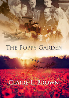
Once Jeanie had the information she started drafting out a
cover design and at the beginning of January she sent me her first iteration of
the cover;
 |
| The Poppy Garden Draft Cover 1 by J Henning |
This first cover has all the elements I asked for;
- Link to my Grandfather’s memory
- Link to the RAF
- Link to Army /other military
- Modern Day Military
- Sandy almost sunset colour
- The Poppy
The impact is immediate and I do love the way this cover
looks, however I have to look at it from a readers point of view. So I consulted with a couple of trusted
friends/readers and asked their immediate opinion.
This cover elicited in them thoughts of;
- World War 2
- Romance
- Wedding
- Historical Fiction
Not quite what the Poppy Garden is about so although I love
it, it misses the mark for the reader.
I sent my feedback to Jeanie and we discussed how to improve the first
draft. For me the wedding picture in the
top corner led the reader in the wrong direction. While I still wanted to use this image somehow
to honour my Grandfather, his crew and my Nan who had the strength to support
him and never stop believing in him the cover wasn’t the place to do it.
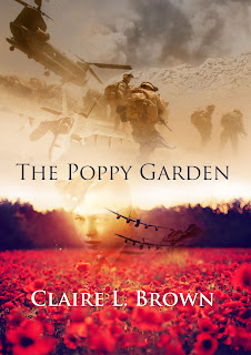
Jeanie took my notes and set about working on draft two;
 |
| The Poppy Garden Draft Cover 2 by J Henning |
As you can see from draft two, we removed the wedding image which I had decided belongs
with the dedication inside the book.
The font is classic and also links to my two previous novels
keeping a theme for me as an author running through all my work
We kept the poppy image which roots the novel in remembrance
The watermark effect picture of my grandfather in his
uniform links the book to his memory
The Lancaster bomber images hovering above the poppy and
next to my grandfather honour his and my connection to the RAF and these great
planes.
The images of modern warfare and military point the reader
in the right direction for the story
The smoke and desert hit towards some of the defining
moments of the book
I again consulted my chosen reader friends who felt more
comfortable and attracted to the cover. I
also consulted with several of the officers I work with within the Fire and
Rescue Service to see whether this would appeal to them and I got positive
responses.
So this is what the final cover will look like, I love it
and think it will appeal to my target market.
 |
| The Poppy Garden Final Cover Design, J Henning, C Brown 2016 |


Comments
Post a Comment